Considering my experience with Adobe Creative Suite in high school, it was nice to reconnect with the program that inspired me to pursue a graphic design career in the first place. I took LMC 2720: Principles of Visual Design in Fall 2022, and this project was like returning to an old friend.
Brand Design, Case Study, Design System, Web Design, Wireframing
ROLE
TIMELINE
TEAM
TOOLS
Graphic Designer
6 weeks (Oct. 2022 - Dec. 2022)
Jason Yang
Photoshop, Illustrator, InDesign, Figma
OVERVIEW
My Contributions
Analyzed case study and created brand identity prism for local bakery/cafe that greatly informed the foundation for our project
Designed and made mockups for posters, menus, business cards, and the website to showcase the brand identity
Crafted a complete brand style guide on InDesign to showcase the culmination of our work
Problem
Sweet Hut is a local Taiwanese bakery based in Atlanta and has been a monolith in Georgia’s Asian American community for over a decade. It prides itself on modern takes on traditional comfort food, but its goal to provide affordable options for high-school-to-college-age students can detract from the product’s quality. It profits by providing lower-quality ingredients that compromise the authenticity and the comforting, caring relationship it fosters with customers. This results in the food being more comparable to a fast food restaurant than to that of a parent’s.
CASE STUDY
Analysis
We created a brand identity prism for Sweet Hut’s brand to assess the company’s image and potential marketing strategies it may use. By mapping this out, we discovered that Sweet Hut tries to cultivate its brand by coming across as a relaxed, comforting cafe akin to home.
Interestingly enough, however, the company’s brand identity prism and mission do not align. Sweet Hut’s mission is to, “Serve delicious, affordable food that guests will want to return to week after week,” which implies that their primary goal is to establish a recurring customer base by providing cost-effective options. While this is a commendable goal that Sweet Hut accomplishes well, it misses the mark when selling food made with quality ingredients that a parent might cook. Additionally, the cafe serves quick bites that would usually be street food in Taiwan, such as salt and pepper chicken nuggets, which harkens back to the previous point.
Through this case study, we discovered that our goal for this project was not to criticize or rebrand the beloved Asian American hangout spot but rather to create a new speculative restaurant that would align more with Sweet Hut’s brand identity prism: a place that serves delicious comfort food made with quality ingredients that is just as warm and inviting as its predecessor.
DEVELOPMENT
Style
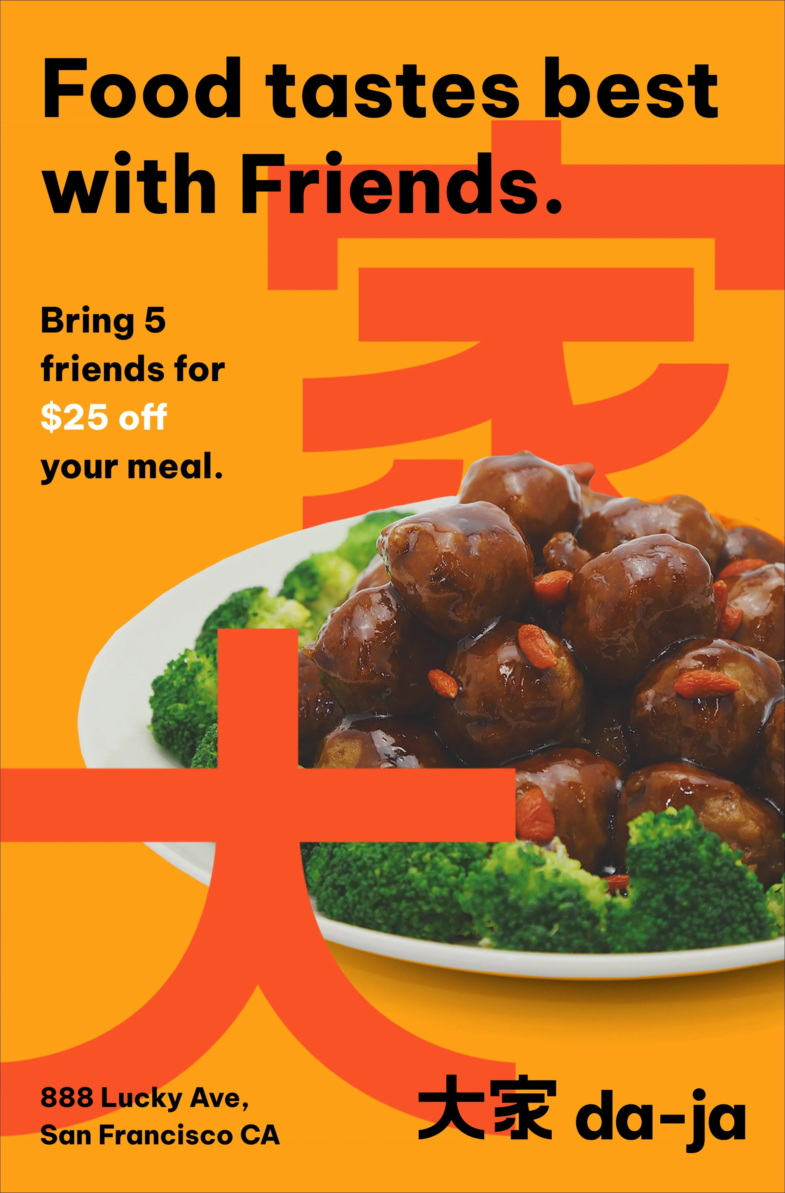
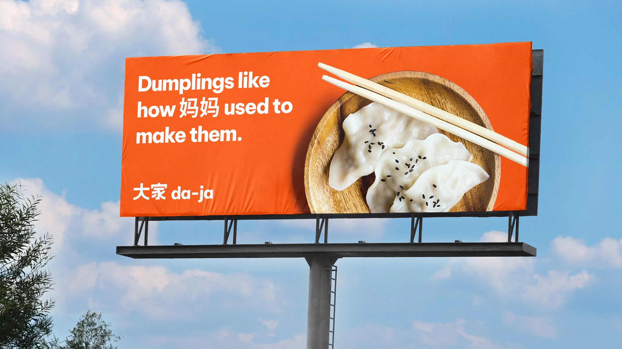
We decided early on to emulate a clean, minimalist brand with bold accents and a sans-serif font to communicate the restaurant’s modern take on traditional foods. This means using only a few words on advertising materials and cutting out pictures of dishes to put on solid colored backgrounds. The Chinese characters in the logo, itself, is a simplified Romanization of 大家, meaning everyone.
Logo
REFLECTION
APPLICATION
The Brand in Action
FINAL BRAND GUIDE
If the embed isn’t working, please view here.
Color
Determining a color palette was the most important first step for our project. While we experimented with a plethora of color combinations, we ultimately decided on three colors that fit our vision of strongly representing Chinese American culture.
The primary color, Egg Yolk, and one of the secondary colors, Mandarin, are inspired by the traditional bright yellow and red color combination often seen in Chinese culture. Egg Yolk is a deeper orange to balance the brighter red-orange Mandarin. Peach is an accent color that works nicely with the two, and it is also reminiscent of the pink peaches that Sun Wukong enjoys eating.
Takeaways
It’s easy to take for granted every company’s existing style guide!
Creating an entirely new brand from scratch is tough work. My partner and I spent almost a week trying to decide what color palette to use. Every time we opened the Figma file, we added more color combinations which made it even more difficult to pick. From meticulously spacing logo elements and messing around with every sans-serif font we could find, it was an iterative and arduous process that required a lot of feedback from each other and our peers. I learned to prioritize honest communication with my partner by constantly updating him on what I was working on and providing constructive criticism. This was a fun project that truly grew both my design skills and ability to work on a team immensely. The end product is extremely rewarding; it feels like we’ve created a restaurant of our own, even if it isn’t real.


